Bright alright
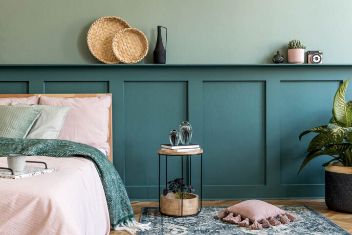
If you can’t experience the colours of the world at large, paint your house in them. Or so is the thinking behind an emergence of bright, vibrant colours adorning the interior décor of homes around the globe.
Colour psychologists and interior experts alike are attributing the rise of abundant colour choices – like blushing pastels and intense natural shades of greens and blues – to people trying to bring more emotion, joy and happiness into their homes.
Apparently, this gives residents of colourful abodes the stimulation which is hard to come by as their regular, non-pandemic adventures are curtailed.
Those trending natural tones are also taking a more neutral earthy turn, with warmer clays and muted mustards and smoky, stony greys also popular; providing a calming balance to more sanguine shades.
When it comes to incorporating these hot hues into your own rooms, if you’re not bold enough to paint your lounge pink or your bedroom moss green – experts suggest choosing a neutral shade with a faint undertone. A cool beige with a green undertone can still have a calming effect, and a more muted, dusty pink still imparts comforting optimism.
Likewise, kitchen cabinetry or skirting boards can be painted in a deep moody navy to invoke grandeur and contrast, or colours reinterpreted into the paint finish itself. Choosing a gloss
or matte paint can achieve added texture and interest in any shade.