
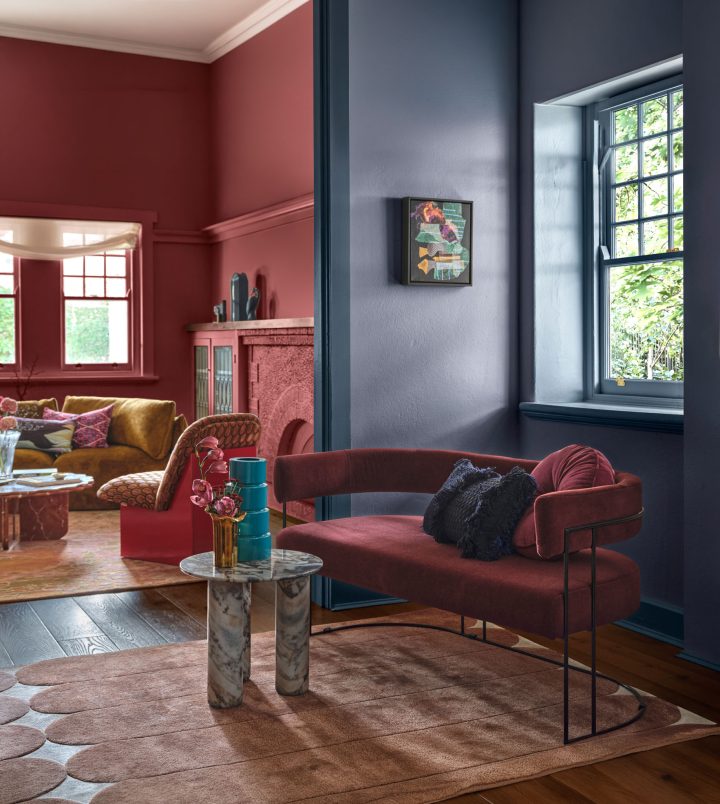
What’s to come in colour?
Colour forecasts in 2027 reflect a world shaped by algorithms, endless content and digital noise.
“As we become increasingly technologically sophisticated, many of us are also feeling more socially disconnected. In a world shaped by algorithms, endless content and digital noise, there is a growing sense of sameness and overstimulation,” says colour and design specialist Davina Harper, unveiling Dulux’s colour forecast for 2027.
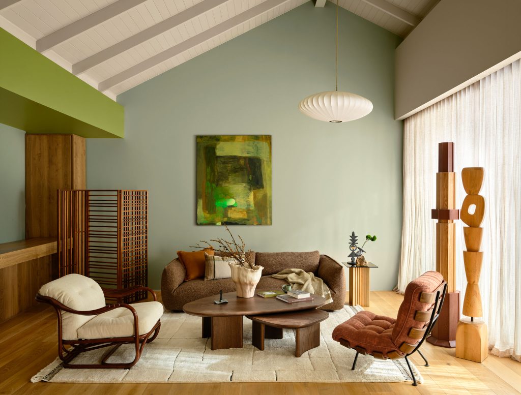
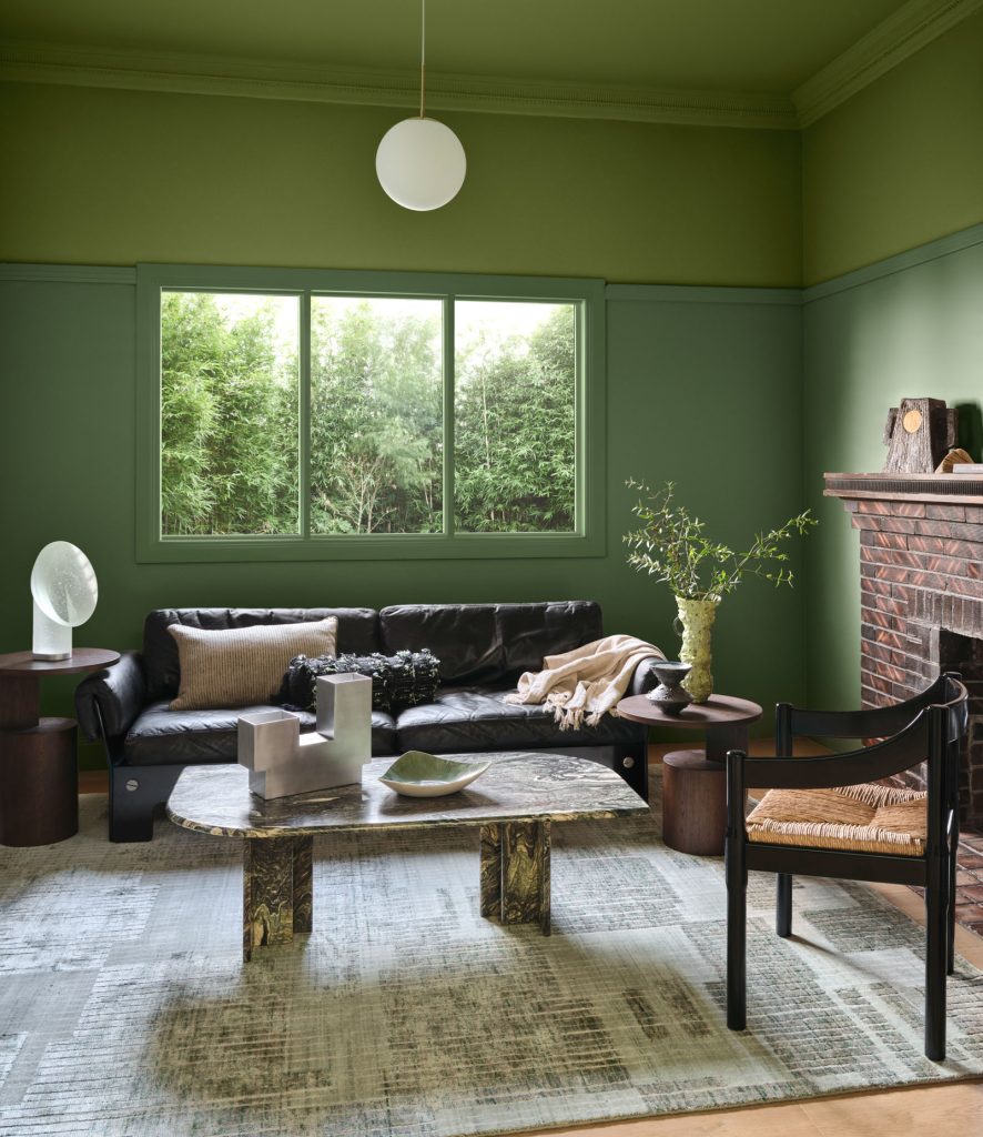
Three palettes named Play, Treasure, and Sensory explore the colours shaping our homes, celebrating joy, individuality and everyday rituals at a time marked by rising living costs and the rapid acceleration of artificial intelligence.
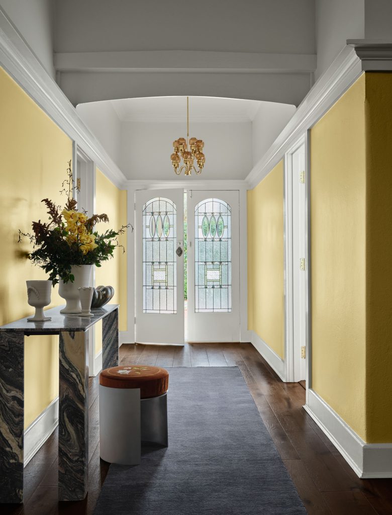
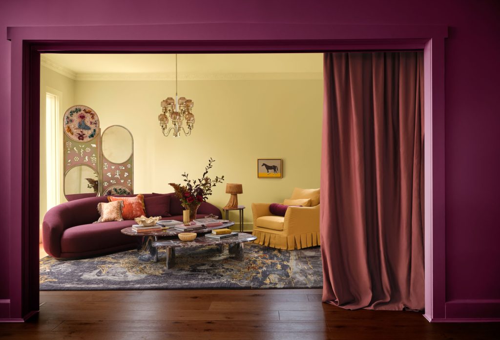
“The palettes reflect an urgent desire to create spaces that feel more personal, expressive and deeply human,” Davina says.
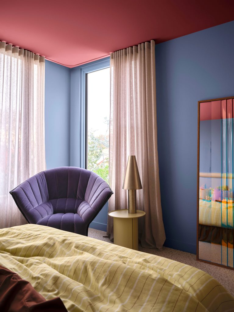
In response, New Zealanders are seeking colours that offer a sense of balance and belonging, creating calming and vibrant interiors that reconnect them with the natural world and encourage introspection and joy. The palettes feature calming blues, comforting botanical tones, and sophisticated jewel-like shades.
A return to softened yellow-greens and blues with grey and purple undertones offer grounding, while bright berry and cherry accents serve as markers of optimism.
“To distill the ever-evolving trend landscape, the Dulux Colour Team collaborates closely with international brands, attends design shows and seminars, forecast presentations, and global events including Milan Design Week,” says Davina. “We also draw from customised trend research and insights accessed through Dulux’s global network across the United Kingdom, Europe and Asia-Pacific.
As members of the Color Marketing Group (CMG), we analyse key reports from CMG as well as forecasting firms such as Color Hive and LS:N Global
to enrich our forecasting to reflect what’s ahead.”