
Natural attraction: Resene
Encourage sweet soothing sleep with a bedroom painted in soft character neutrals, filled with natural texture and a warming palette of colours. Bohemian-style has really enjoyed its time in the sun. Traditional boho style is a delightful mix of pattern and bright colour to create perfectly undone – but totally done – spaces.

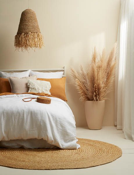
PAINT: Wall in Resene Eighth Canterbury Clay; floor in Resene Eighth Joss; bedhead in Resene Eighth Joss; large pot in Resene Quarter Bison Hide.
FURNISHINGS: Bed linen, lamp shade, rug, cushions, purse from Mood Store and all other accessories are stylist’s own.
While this jumble of eclectic goodness is still popular, bohemian-style has taken a slight U-turn into a more minimalist realm of interiors. This new take still celebrates the relaxed, natural appeal of traditional boho looks but tones it down with a more neutral colour palette.
This room has done just that by utilising a base of character neutrals. These, as the name suggests, are neutral hues. But they’re much more intriguing than your typical true neutral, which can end up looking cold or flat. Thanks to their subtle undertones, these hues with soul bring that extra little something to a space.
In this room, Resene Eighth Canterbury – a warming character neutral – dons the walls while Resene Eighth Joss covers the floor. These two hues provide the perfect base for other colours and textures to be layered on top while still adding to the atmosphere of the room themselves.
If you want to go further with natural textures, you could also bring in raw wood finishes, dried flowers or clay ornaments – the different grains and materials will add that little bit of extra character.
A crisp white, like Resene Quarter Black White, is needed in this space to prevent it being too beige and too soft. Here, it’s brought in through the fresh white linen bedding – again, achieving that balance of edgy but soft.
Soft apricots, such as the linen cushions, provide sweet pops of colour and work particularly well when paired with dusty pinks, such as Resene Just Right.
To achieve this look, be cautious of veering too close to vibrant coral hues. Instead, keep your palette of oranges and pinks relatively muted – they’ll be gentler on the eye and won’t overwhelm the room’s quiet calm.

Resene Eighth Pavlova
Resene Quarter Bison Hide
Resene Mai Tai
Get inspired at your local Resene ColorShop, www.resene.co.nz/colorshops.