A study in contrast
Decorating with complementary colours can be a challenging look to pull off, but when everything comes together, the results are memorable. The key is finding the right tones that work together – instead of competing with one another – and then working in a mix of darker and lighter shades.
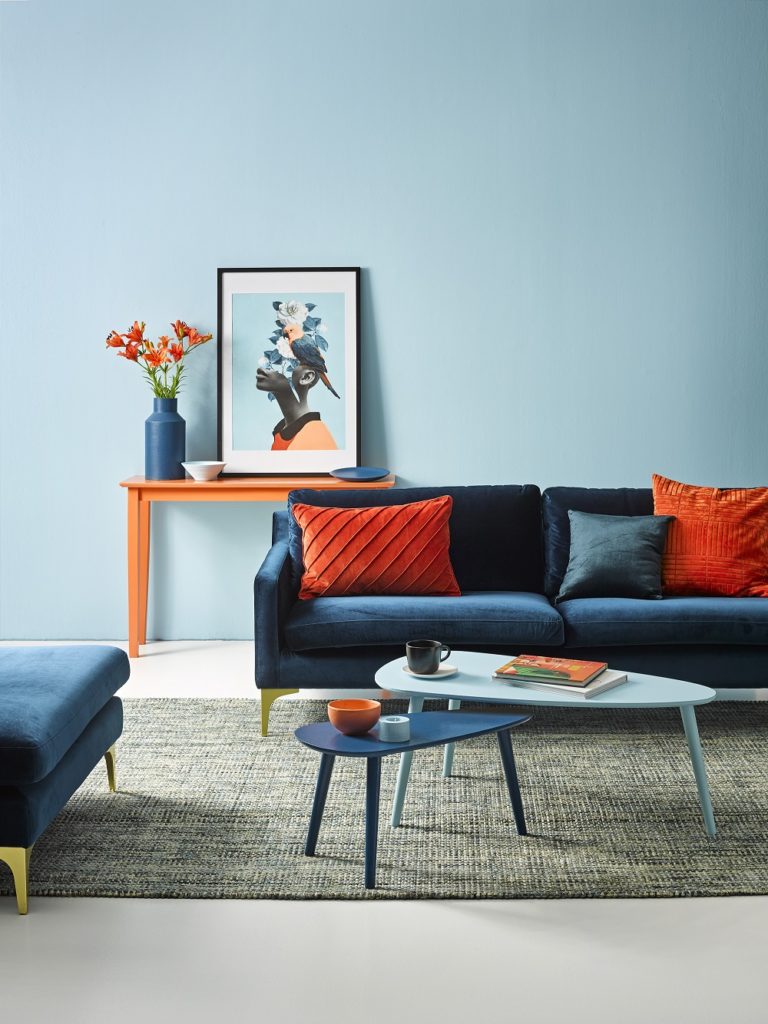
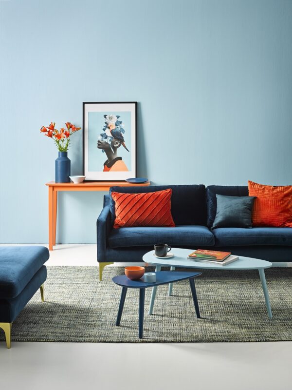
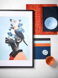
In this space, the sofa and the pendant lamp, vase, dish and small retro nesting table in Resene Wishing Well provide high contrast with the Resene Bluetooth walls and Resene Jailbreak console, while the small bowl in Resene Japonica brings in a softer orange to balance out the look and play off tones in the artwork. Neutral floors in Resene Alabaster lighten things up and keep the bold tones from becoming overpowering, while the floor rug adds another layer of visual texture.
Other colours that look great with high-octane orange are pewters, deep slates or midnight blues – try Resene Artemis, Resene Fast Forward or Resene Twilight Zone.
Get inspired at your local Resene ColorShop, www.resene.co.nz/colorshops.