Spring Fling!
Spring has long been associated with regeneration, but it’s equally time to update, refresh and create a whole new vibe. We’ve looked forward to the spring 2020 colour palette so you can prepare for a spring fling!
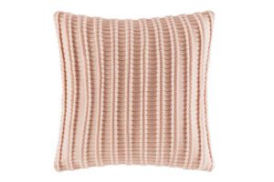
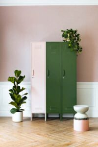
MAKING ME BLUSH: ‘Millennial Pink’ has been a colour craze since the summer of 2016 and it is showing no sign of slowing down. It’s a colour that has paved the way and angled the spotlight on the ‘world of pink’. By doing so, it has allowed for the colour blush, a more subtle version of the punchy millennial pink, to come to the forefront. The colour matches well with white, camel and soft pink.
FEELING BLUE: Classic blue is Pantone’s colour of the year for 2020, making it a hue that you’re more than likely to see everywhere this year. Described by Pantone as “a reassuring presence instilling calm, confidence and connection”, blue has long been used to connote serenity, reflection, calmness, serenity and trust, helping to calm the mind and help it focus.

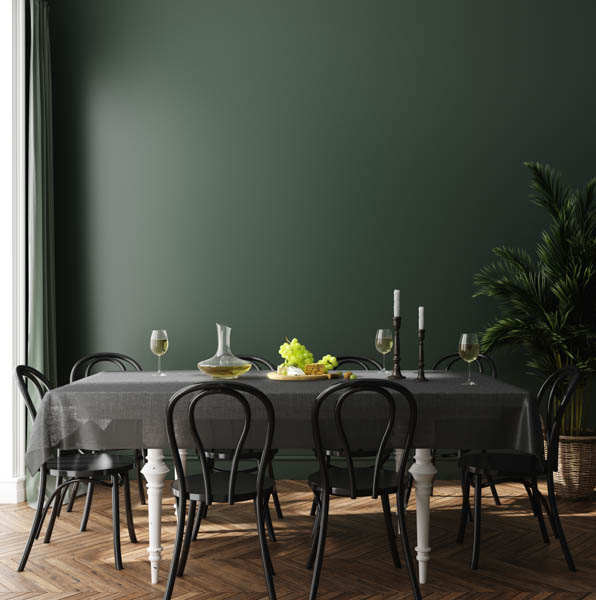
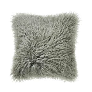
GREEN WITH ENVY: Green is another colour to watch out for in spring this year, specifically sage green. There’s something that’s so fresh and organic about it. Not to mention it’s unisex, perfect for masculine and feminine spaces. The ‘go green movement’ doesn’t just have to represent the switch to sustainability, go green in all aspects of life.
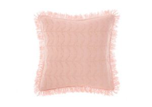
PRETTY AS A PEACH: Peach Jelly to be exact. This pastel peach will be all the rage next season. The colour really gets a chance to pop when it’s matched with strong shades of dark green or grey. It looks great on accessories around the home such as rugs and cushions.
GOOD AS GOLD: Maybe don’t go overboard with this one… the only place ‘all-gold’ everything looks good is in a palace. But that’s not to say that it can’t look good in splashes throughout your space – it’s time to create a regal feeling. It also pairs nicely with the sage green listed above.
