
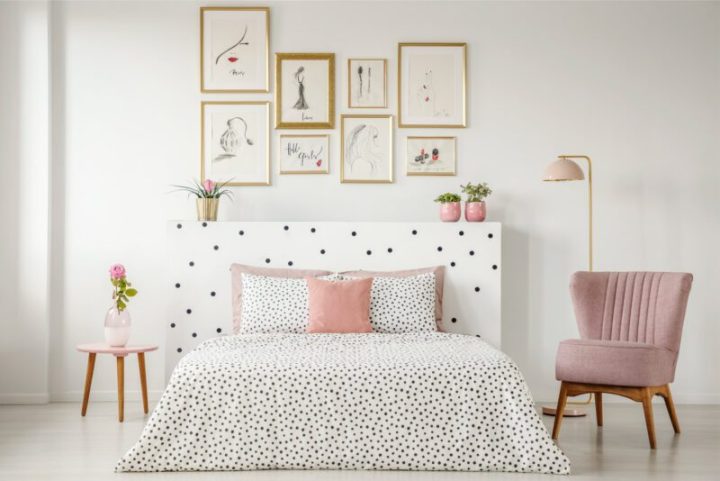
Playful polka dots
There’s a playfulness to polka dots that keeps them timeless and often makes them a favourite in the fashion world. And while whimsical, they can also add an air of sophistication to an interior space when used subtly.
Here are a few tips for working polka dots into your home.
Size and colour
If you are going for playful, then larger dots coupled with highly contrasting colours will draw attention to the pattern. For a subtle look, using more neutral colours that do not obviously clash can also be effective while retaining a level of fun.
Strike a balance
A balanced room will look sophisticated. If polka dots are used on a pillow or small feature, then you can go bold with colour. If you’re covering a room in dots, go for less colour. Remember that scale is what makes or breaks a room. You need a balance of scale, pattern and texture to create a well-composed room.
Keep it neutral
To keep polka dots from looking too childish, opt for more neutral colours, or black and white, and focus on the scale. Dots that are too large can look like they belong in a nursery, but smaller, black-and-white polka dots on a statement chair or wallpaper in a bedroom or office can look sophisticated and chic.