
Cosy colours for winter
Darker colours absorb more heat which is one reason why it is better to switch from light to dark during the colder months.
Most traditional winter palettes include neutral grays and browns, as well as cool hues such as sky blue and deep plum. Many also include warmer red and gold accents to balance the design.
Changing a room’s aesthetic can be as simple as swapping light summer blues, creams, and whites for the darker, warmer hues of autumn and winter. Think throws, cushions and even winter weight curtains, and fill vases with fragrant wintersweet, dried hydrangeas and the like.
If you’re short on inspiration, take a leaf out of nature’s seasonal colours. Here are some tips:
- Berries and fruits – thinks of rich deep plum colours, burgundy, berries, and dahlias.
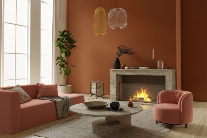
- Autumnal browns, rusty oranges, and earthy tones create an instant sense of cosiness.
- Deep sea blues, such as navy, make a space feel intimate and inviting, perfect for winter cosiness, yet versatile to pair with white for a smart summer appeal. It’s also a great background for art.
- Forest greens both contrast and complement other light and dark colours.
- The warm brown hues of wood create a soft glow and easy ambience, especially at night.