Print this story
Achieving the right balance when working with patterns and prints is vital for an eye-catching end result. Many people who love patterns struggle to find that balance, yet there are some simple rules that can help. Try these:
- There are no rules. Patterns can all be different yet work well together to form a lovely abstract. Look for a similarity in them such as the same colour somewhere in each.
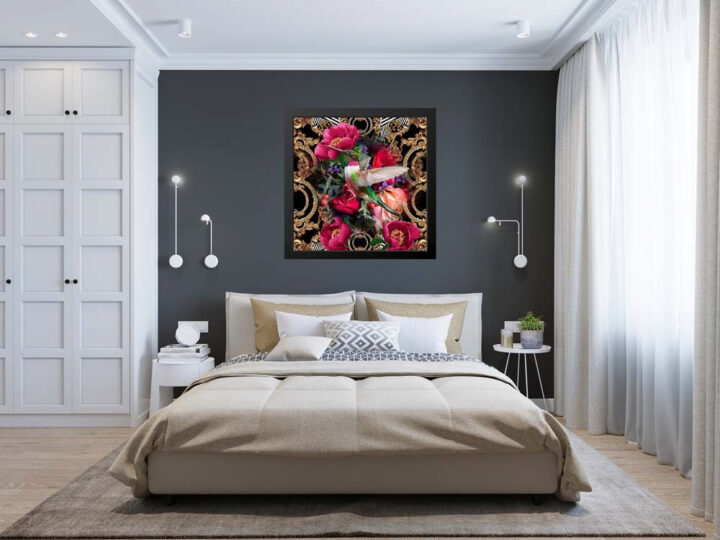
- Exercise restraint and use plains along with patterns. For instance a colourful artwork might work better on a plain wall, a single colour cushion on a patterned bedspread, and brightly coloured patterned towels in a white-tiled bathroom.
- Decorating a room often starts with a rug and these are terrific for adding pattern and vibrancy, and pulling a room together. Bigger is better.
- Choose fabrics before paint colours. It’s easier to find a paint colour that works with your fabric than the other way around. Pick your curtains, and bedspreads first if it’s a bedroom, wallpapers first in living rooms etc.
- Once you have found your main fabric, look for others that will combine and complement it. Think about the room’s soft furnishings: cushions, upholstery, window seats, headboard, valances and so on.
- Use three or five colours in your scheme and balance these within your patterns and plains. Start with a neutral baseline – cream, black or brown – then play around with other hues to add contrast. Look for one patterned fabric that ties all the colours together.

Previous Post
Next Post