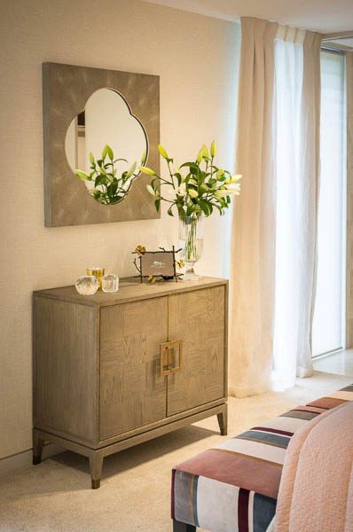
Serious decorating punch: Armstrong Interiors
When it comes to the home, accessories have the power to make or break your space. We sought the inside scoop from award-winning interior designer Angelique Armstrong from Armstrong Interiors about how to use accessories to pack some serious decorating punch.

What are your top tips for picking accessories for the home?
When choosing your accessories, they could be favourite pieces handed down through the family, or a new piece that you like for some reason or another. Everyone is different, so personal needs are different when dressing your home. We live in a very disposable world these days. When you choose something, it is best to love it. Buy things you will treasure, look after and even enjoy for many years.
What accessories are worth investing in, rather than those with a lower price point?
This really depends upon your priorities and budget. Some people love to collect objects, paintings, coins, bottles, pots etc. These can all be used in clever ways, displayed for decorating your home. For example, choose a vase that you love that is beautiful on its own – this way it may not need dressing, or if it does, try a small amount of greenery from the garden or a tea candle, rather than expensive flowers. I believe you can cleverly put together items from high and low price points and make them work together.
Art is a great way to add colour and interest to a room, how do you make sure the accessories complement and not detract from the art?
Art again is a very personal taste; for some people, the more colour the better, while others prefer a more neutral palette. I believe anything in wall/sculptural art goes. You can put a new frame on a classic old water painting and it will look fabulous in a new home. Be clever, think outside the square and do what is right in your heart and home.
The trend of odd numbers of items together is very popular in interiors and even floristry, does this apply to accessories?
Unless we are specifically working on a symmetrical look, this definitely applies, because for some reason it is more pleasing to the eye. One, three and five are good numbers to work with, and different sizes create different levels and shadows, which is interesting.

Armstrong Interiors Ltd


