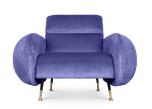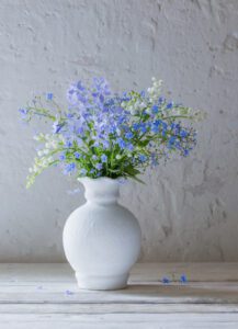
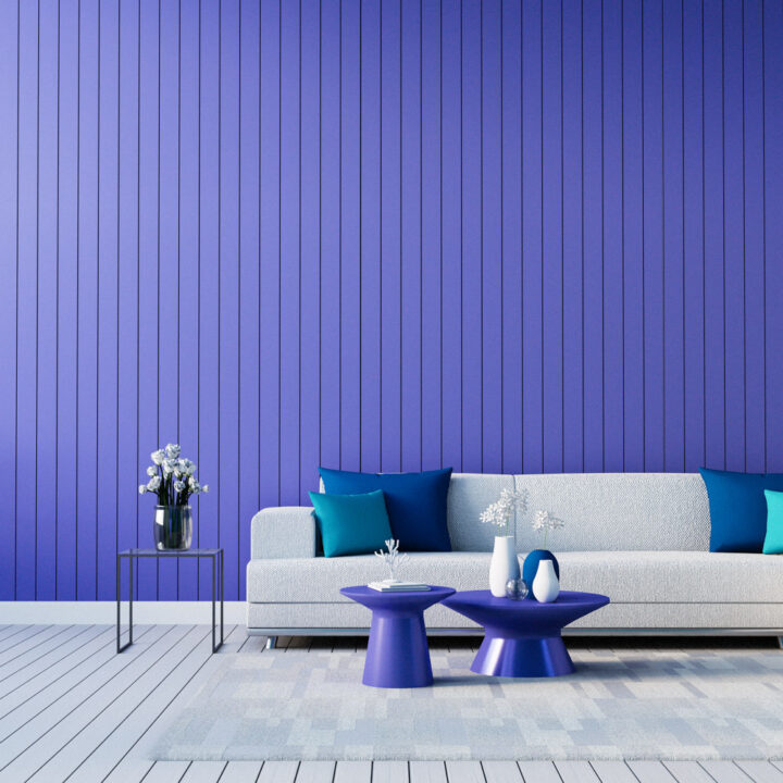
Perfecting periwinkle
Pantone’s colour for 2022 is ‘VeryPeri, a combination of blue and reddish violet, named after the periwinkle flower. Purple is a word that springs to mind, but it’s more of a blue-violet hue which can look amazing when used to brighten an interior.
As a colour it works superbly with white, and also with most other colours. A feature wall may be a starting point, but keeping it simple by using accessories is also a good way to go. Here are some ideas: