Pattern play: RESENE
Is there any colour combination more classic than black and white? A duo like no other, designers and decorators are often drawn to what’s known as an achromatic colour scheme for its simplicity, minimalism and timelessness.
 Achromatic and monochromatic are terms often confused. An achromatic colour scheme is one that possesses no hue, made up of only black, white and grey while a monochromatic colour scheme uses varying shades of a single hue, such as blue.
The key to an awe-worthy achromatic scheme is to make great use of the bold contrast that black and white offer, and to look for ways to play up shapes and patterns to bring in a sense of texture and continuity through repetition.
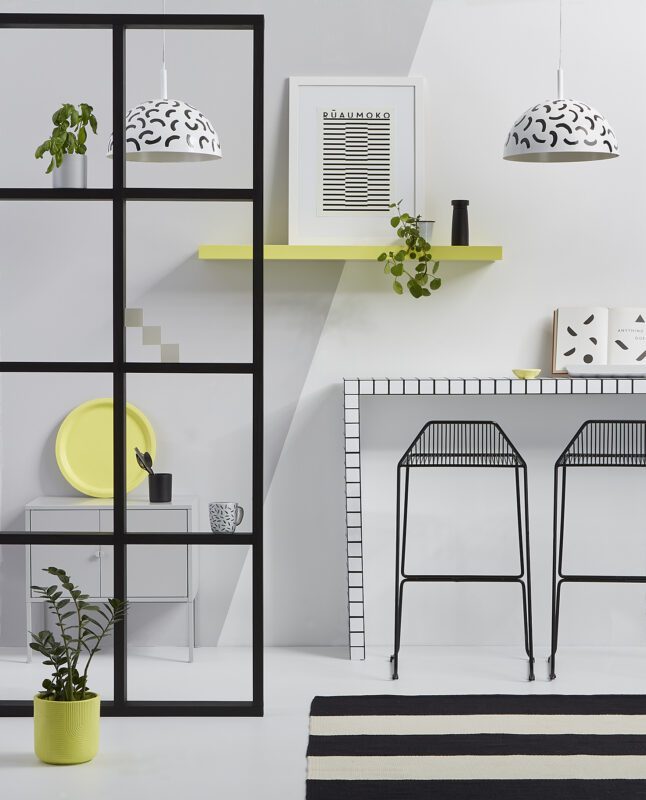
Resene Eighth Black White is nearly as neutral as paint colours come, yet in this contemporary studio, it looks striking as the main wall colour in contrast to Resene Half Concrete flooring and when layered with Resene Blackjack designs on the breakfast bar and pendant lamps. By choosing patterns with simple motifs, you can easily layer more than one different type into your design.
To create the look of the grid design, the bar table is painted in two coats of Resene Lustacryl semi-gloss waterborne enamel tinted to Resene Eighth Black White. Once dry, use a ruler and pencil to help you apply parallel strips of 36mm wide high quality painter’s masking tape 10mm apart, pressing firmly to ensure it adheres well. Use a mini roller with a smooth surface sleeve to apply two coats of Resene Lustacryl tinted to Resene Blackjack. Once the paint is dry, remove the masking then repeat the process again perpendicularly.
The pendant lamps are painted in two coats of Resene Lustacryl tinted to Resene Blackjack. Once dry, use a small flat artist’s brush to paint simple randomised curved strokes. Leave approximately 5cm of space between each stroke and continuously alter the directions.
The Latin phrase ‘omne trium perfectum’ conveys a key design principle known as ‘the rule of three’. You can apply this technique with any accent colour to create a sense of balance. Paint a round tray, a small dish and a large plant pot in Resene Canary and distance them throughout the room. Because the same hue is repeated, your brain will automatically connect those painted items and you’ll be left with the sensation that the design is cohesive. Plus, spacing the items out causes the eye to move from one object to another, forcing it to take in and appreciate the whole space.
If yellow doesn’t suit your tastes, swap Resene Canary for another vibrant primary colour such as Resene Havoc red or Resene Endeavour blue in keeping with the Bauhaus-like modernist feel of this design.
Get inspired at your local Resene ColorShop, www.resene.co.nz/colorshops.