Landscape to living space
Canterbury’s iconic landscapes inspire the latest in summer colour trends.
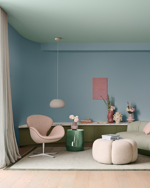
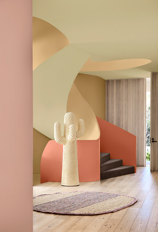
Light, fresh, and easy to live with – that’s the brief for summer colour according to Dulux colour forecasters. Romantic tones and airy pastels represent a shift from bold statements to softer hues that work with natural light and bring a sense of ease to interiors.
A selection of iconic Canterbury landscapes shape the seasonal palette. Several trending hues are named after local landmarks and locations, offering a subtle connection between interior spaces and our surrounding outdoors. According to Dulux Colour Specialist Davina Harper, the move toward gentler colour reflects a need for familiarity and changing priorities at home. “In a world marked by uncertainty, we’re seeking ways to create calm and nurture our emotional wellbeing,” she says.
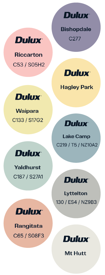
Bishopdale: A floral fresh purple referencing flowers in full bloom. Works well with soft dusky pinks.
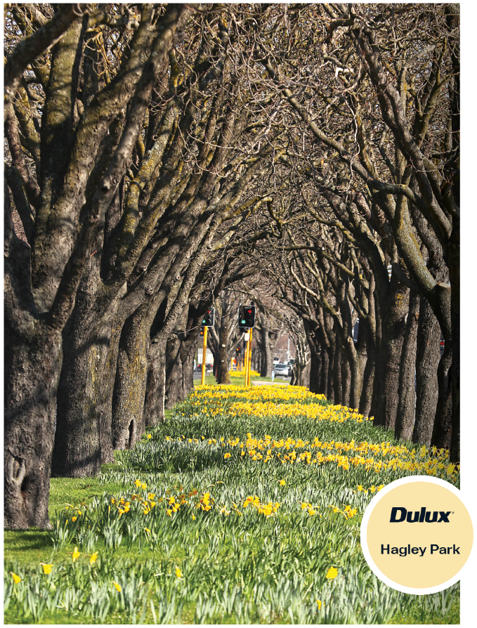
Hagley Park: A soft and cheerful yellow that creates the feeling of sunshine, referencing one of Christchurch’s most recognisable landscapes. Used thoughtfully, it introduces colour without feeling decorative, working well in bedrooms, bathrooms or garden-facing rooms.
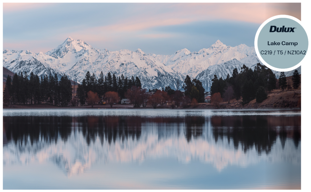
Lake Camp: Light and understated, Lake Camp reflects the stillness of high-country lakes. Lighter shades like this are particularly effective in smaller rooms, helping spaces feel more open and airy.
Lyttelton: A slightly deeper coastal tone reflective of the humming harbour, that brings subtle contrast while remaining within a soft palette. Well-suited to interior and exterior walls.
Mt Hutt: A soft, chalky white, Mt Hutt references alpine light and works comfortably in contemporary interiors. It pairs easily with timber, stone and natural textures.
Rangitata: A soft blush inspired by Rangitata River’s abundant salmon. It works well with warm, sandy neutrals or deeper shades of orange and terracotta.
Riccarton: A dramatic pink inspired by September blossoms.
Waipara: Warm and understated, Waipara reflects the tones of golden grape country. It’s an effective option for south-facing spaces to create a light-filled, bright setting.
Yaldhurst: Evoke a feeling of relaxation and wellness in your space with this soft green, reminiscent of the retro cars tucked away in the Christchurch suburb.
The appeal of these close-to-home colours lies in their versatility. Designed to be layered rather than contrasted, they suit a range of homes, from new architectural builds to established villas, and respond well to the region’s changing light. In Canterbury homes, where light levels shift throughout the day, testing colours in situ remains key. Pale greens, blues and warm neutrals tend to respond well to both morning and evening light, maintaining clarity without appearing flat.
Rather than dramatic changes, the trend favours subtle updates – extending colour across walls and ceilings, working within a tonal range, and allowing furniture and materials to add texture and interest.
FUN FACT
To Pantone’s 2026 Colour of the Year, Cloud Dancer, Dulux’s colour match was Canterbury’s very own Mt Hutt – a calm colour that balances out bolder, more vibrant decisions in interior design to avoid overpowering the home.
Due to variables in the printing process, actual colours on these pages are a representation only.