A sign of the times
“In times of uncertainty – including today’s cost-of-living pressures and geopolitical unrest – consumers tend to gravitate toward stability in design,” says Davina Harper, Dulux’s colour and design specialist.
“Colour has the power to lift spirits, offer emotional reassurance and bring a sense of calm into our homes,” Davina says, which is why you’ll find these comforting hues in Dulux’s colour forecast for 2026. In response to continued global uncertainty and digital fatigue, the curation of three distinct palettes sees a rise in calming and connecting colours. Curated with extensive research across local and global trends, these hues reflect a universal yearning for wellness, stability and reconnection. Davina translates her yearly visit to Milan Design Week into inspiration that captures a new way for New Zealanders to live at home.
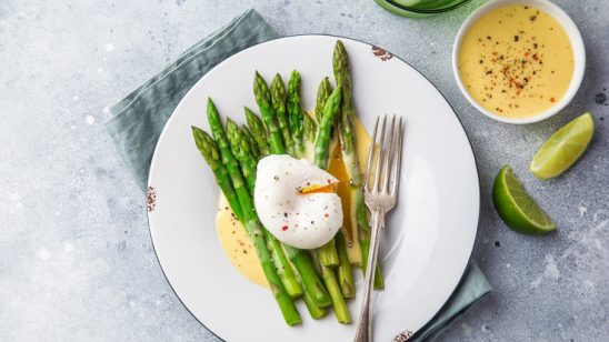
This year’s forecast champions warm earth-based neutrals, rich burnt oranges, caramels, and greens such as sage, moss and spearmint. Soft pinks and vintage rose tones also feature, alongside tender pastels and muted berry shades.
“Among the changes this year is the rising dominance of spearmint green, complemented by soft earthy pinks that pair beautifully with browns and burgundies,” Davina notes. “These trends mirror our collective desire for grounding and positivity. In contrast, brighter colours are used sparingly to bring personality and optimism into spaces. These include playful berry hues, pinks and rich accents such as burnt orange and vintage pink, layered over tactile materials.”
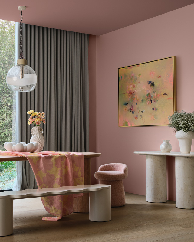
ETHEREAL
The “most expressive palette”, Ethereal is feminine and whimsical – a magical celebration of nature’s nurturing power. “The materials feel soft and inviting – like soft oak, bleached wood, and plush fabrics with gentle botanical designs. Shiny surfaces like glass and chrome bring light, whilst sand-blasted textures soften the shine, creating a dreamy, layered look,” Davina says.
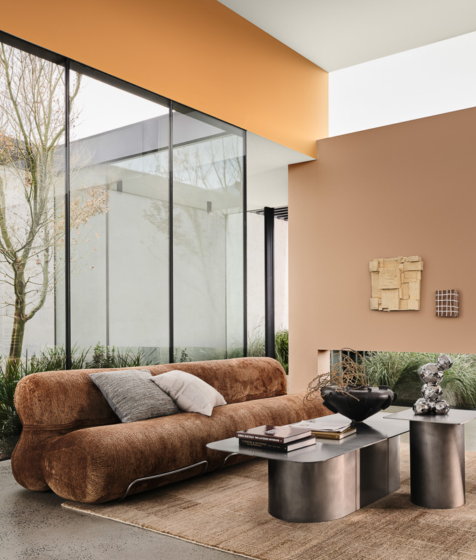
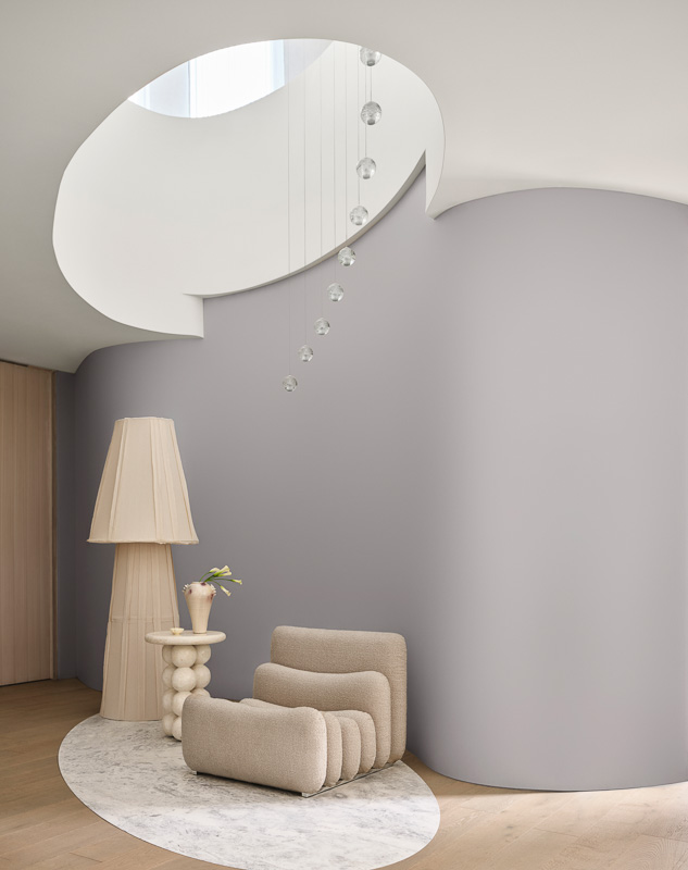
ELEMENTAL
A calm, grounded response to the overstimulation of modern life, Elemental is rooted in anti-burnout culture. Subtle layers of grey bring structure while dark, charcoal tones add depth and dimension. Clean lines, raw concrete, polished marble – materials purposefully combine style and practicality with an industrial edge.
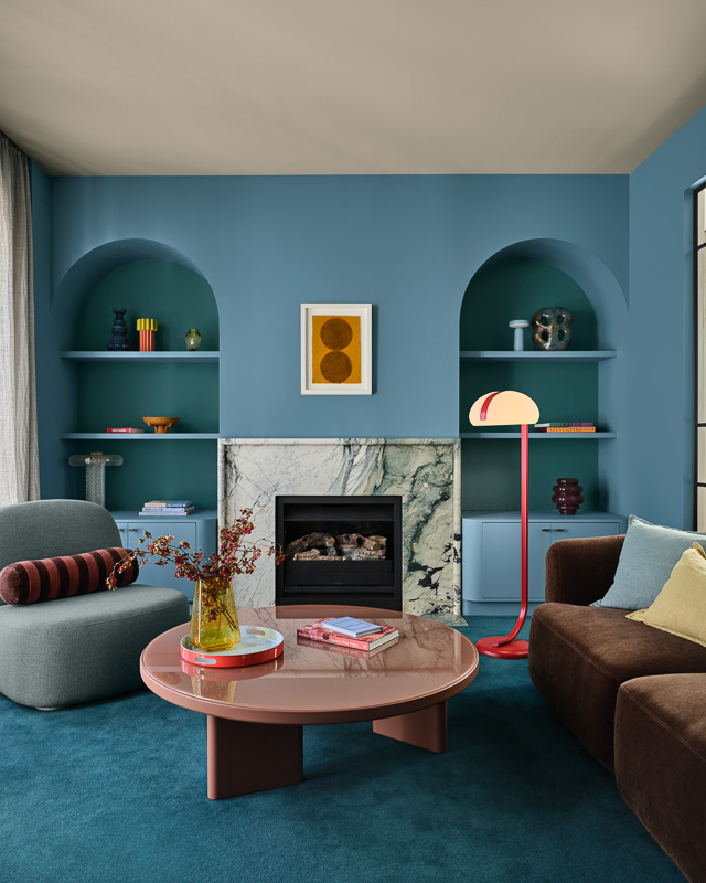
EVOKE
Favouring the eclectic aesthetic, Evoke showcases vintage-inspired materials and curated clutter alongside deep comforting tones. Optimistic, bold and expressive, the palette channels individuality and emotional warmth – a reflection in the rise of antique and one-of-a-kind shopping. “Chrome and aluminium replace gold, whilst bold colour layering and clashing prints add texture, charm and a sense of layered character,” Davina advises.